ApplyBoost 2.0 : Designing a clearer path from student interest to advisor connection
Improving onboarding, partner selection, and lead-management clarity for a multi-sided SaaS workflow.
Getting Started
A student onboarding and partner selection system
ApplyBoost 2.0 was a redesign initiative within ApplyBoard focused on making the ApplyBoost experience clearer for students, Recruitment Partners, and internal teams. The project addressed friction across onboarding, partner selection, lead status visibility, and operational workflows, turning a complex multi-sided experience into a more structured, transparent, and scalable product flow.
My work focused on translating research insights, product requirements, and stakeholder input into clearer user flows, wireframes, high-fidelity UI, interaction patterns, design-system-aligned components, and engineering-ready handoff.
Role
Product/UI Designer — Interaction Design, Design Systems & Handoff
Client
Internal — ApplyBoard Inc.
Tools
Figma, Jira, Confluence, Airtable, Miro
Duration
2 months
Focus Areas
Onboarding, partner selection, lead management, workflow clarity, information hierarchy, design system alignment, engineering handoff
Methods
Workflow refinement, wireframing, prototyping, interaction design, UI exploration, accessibility-conscious design, design reviews, handoff documentation
Context
A six seconds story
ApplyBoost is a program within ApplyBoard that helps students move forward in their study-abroad journey by either connecting with a Recruitment Partner or continuing independently. Because the experience involved multiple user groups, students, Recruitment Partners, and internal teams, the product needed to make decision-making, onboarding progress, and lead status visibility easy to understand.
After the initial launch of ApplyBoost V2.0 in India, the team identified experience gaps that were affecting engagement and conversion. Students needed more context before choosing a Recruitment Partner, RPs needed clearer visibility into onboarding completion, and internal stakeholders needed a more consistent way to understand lead progress and status changes.
The redesign focused on creating a more guided and transparent experience across two major areas: student onboarding / partner selection, and RP-facing lead management / onboarding visibility. My contribution centered on the design execution phase, refining flows, improving hierarchy, exploring UI patterns, aligning with the Crystal Design System, and preparing designs for engineering handoff.
My design point of view for this project was simple: when a product asks users to make important decisions, the interface should reduce uncertainty. The experience needed to explain what was happening, what mattered, and what action came next through structure, hierarchy, and clear interaction patterns.
The challenge
Problem / Design Challenge
ApplyBoost 1.0 had a functional foundation, but the experience created friction at important decision points.
Students were often sent directly to Recruitment Partner pages without enough context about why they should choose an RP, what value the partner provided, or what would happen next. This lack of explanation created confusion and contributed to drop-off.
RPs and internal teams also faced visibility issues. Profiles could appear complete even when critical information was missing, declined or archived leads were hard to interpret, and stakeholders lacked a shared view of onboarding progress.
The design challenge was to reduce student drop-off and improve conversion by making Recruitment Partner selection clearer, onboarding more transparent, and lead management easier for students, RPs, and internal stakeholders.
Problem statement
How might we reduce student drop-off and improve conversion by making Recruitment Partner selection clearer, onboarding more transparent, and lead management easier for students, RPs, and internal stakeholders?
.png)
Role
My Role & Scope
I was the Lead UI Designer on ApplyBoost 2.0, responsible for design strategy, experience definition, and UI design across key student- and RP-facing flows.
I partnered closely with Product, Engineering, a dedicated UX Researcher, IRMs, RS teams, and internal stakeholders to translate research findings into clear workflows, interaction models, and production-ready interfaces.
My role focused on turning user and stakeholder insights into actionable design decisions, especially around guided onboarding, RP selection clarity, lead status definitions, progress visibility, and reusable UI patterns within the Crystal Design System.
Responsibilities
-
Defined experience principles and success criteria with product
-
Translated research insights into flows, information architecture, and interaction models
-
Designed production-ready UI aligned to ApplyBoard’s Crystal Design System
-
Created onboarding, RP journey, lead management, and matching workflow concepts
-
Facilitated cross-functional alignment with PMs, Engineers, IRMs, and RS teams
-
Iterated designs based on technical feasibility, existing capabilities, and roadmap constraints
-
Supported implementation through design specs, component usage, and design QA
Inputs & Constraints
Inputs & Constraints
The redesign had to balance student needs, RP workflows, internal operational requirements, platform capabilities, and existing design system standards.
Research revealed that different users were struggling with different parts of the experience. Students needed more guidance before choosing an RP. RPs needed clearer onboarding criteria and visibility into missing information. Internal stakeholders needed a more reliable way to understand lead progress, declined reasons, archived leads, and program activity.
The solution also had to work within existing ApplyBoard platform capabilities. This meant improving the experience without assuming that every backend process, access model, or operational dependency could be rebuilt immediately.
Key inputs
-
Internal workflow reviews with stakeholders
-
ApplyBoost 1.0 engagement and drop-off patterns
-
Product and roadmap priorities
-
Engineering feasibility and reuse of existing platform capabilities
-
Crystal Design System patterns and brand guidelines
Key constraints
-
Multiple user groups: students, RPs, IRMs, RS teams, and internal stakeholders
-
Different onboarding states and profile completion requirements
-
Lead status complexity, including declined and archived states
-
Access limitations and role-based collaboration needs
-
Need to reuse and extend existing design system components
-
Two-month delivery window
Opportunity Map
Existing Experience / Opportunity Areas
The research and workflow review surfaced several opportunity areas across the ApplyBoost experience.
1.
Students needed more context before choosing an RP
Students were dropping off when they were sent directly to RP pages without a clear explanation of ApplyBoost’s value, why they should choose a partner, or what support they would receive.
Design opportunity: Introduce a guided onboarding experience that explains ApplyBoost’s benefits, sets expectations, and supports more confident partner selection.
2.
RPs needed clearer completion guidance
RPs believed their profiles were complete, but critical information could still be missing. This created ambiguity around onboarding progress and readiness.
Design opportunity: Create clearer completion criteria, progress indicators, and “what’s missing” states.
3.
Stakeholders needed better progress visibility
Internal teams lacked real-time visibility into onboarding progress, which made it harder to understand where students or RPs were in the process.
Design opportunity: Align lead and onboarding states to a shared mental model across students, RPs, and internal teams.
4.
Declined and archived leads needed clearer actions
Declined and archived leads were confusing and difficult to act on. Users needed clearer reasons, states, and next steps.
Design opportunity: Simplify lead status definitions and design explicit reason-based actions.
5.
Access limitations slowed collaboration
Some workflows required delegation and collaboration, but access limitations made it harder for teams to manage work efficiently.
Design opportunity: Explore role-based access patterns that support collaboration while maintaining data control.
.png)
.png)
.png)
Explorations
Design Exploration
My design exploration focused on three principles: clarity at decision moments, progress visibility, and operational scalability.
For students, the main exploration was around how to introduce ApplyBoost and Recruitment Partner value before asking them to make a decision. Instead of pushing students directly into RP pages, I explored a more guided onboarding flow that explained benefits, eligibility, expectations, and next steps.
For RPs and internal teams, the exploration focused on lead visibility and status clarity. I explored different ways to organize onboarding progress, missing information, declined reasons, archived leads, and action states so users could understand what was happening without relying on manual follow-ups.
I also explored how Student-RP matching could be supported through clearer criteria and more intuitive connection flows, using data points from the student journey to create better alignment between student needs and RP strengths.
Exploration themes
-
How might we explain the value of ApplyBoost before asking students to choose an RP?
-
How might we make onboarding progress visible to students, RPs, and internal teams?
-
How might we simplify lead status definitions without losing operational detail?
-
How might we support Student-RP matching in a way that feels guided and scalable?
-
How might we reuse existing Crystal Design System patterns while extending them for new workflow needs?


Decision Making
Key Design Decisions
The research and workflow review surfaced several opportunity areas across the ApplyBoost experience.
1.
Add guided onboarding before RP selection
Students needed more context before choosing a Recruitment Partner. I designed a guided onboarding experience that introduced ApplyBoost’s value, explained what students could expect, and reduced the pressure of making an unclear decision too early.
Why it mattered: This addressed early drop-off by helping students understand the purpose of ApplyBoost before entering the partner selection flow.
2.
Use progressive disclosure for partner information
Rather than overwhelming students with too much RP information at once, the redesigned flow introduced details progressively. This helped students compare options with better context and less cognitive load.
Why it mattered: Students could make a more confident choice without feeling dropped into a dense partner directory.
3.
Make RP onboarding progress visible
For RPs, I designed clearer progress indicators, completion criteria, and missing-information states. This helped RPs understand what was complete, what was pending, and what needed action.
Why it mattered: It reduced ambiguity around profile readiness and supported smoother onboarding.
4.
Simplify lead status and action states
I redesigned lead states and interactions to create a shared understanding across students, RPs, and internal stakeholders. Declined and archived leads were given clearer reasons and more explicit actions.
Why it mattered: This improved operational clarity and reduced the need for manual follow-ups.
5.
Support scalable Student-RP matching
The Student-RP Match Framework used matching criteria from the student journey to better align students with suitable RPs.
Why it mattered: Matching logic helped turn ApplyBoost from a generic partner-selection experience into a more guided support system.
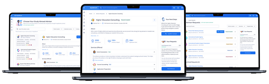
Solutions
Final Solutions
ApplyBoost 2.0 improved two core experience areas: student onboarding and partner selection, and lead management/onboarding visibility for RPs and internal teams.
The final solution was organized around four key product areas.
1.
Enhanced Student Onboarding
I redesigned the student onboarding experience to explain ApplyBoost’s benefits, set expectations, and guide students toward choosing a Recruitment Partner during or after signup.
Key improvements included:
-
Clear explanation of ApplyBoost benefits and outcomes
-
More guided introduction before RP selection
-
Progressive disclosure of RP information
-
Visual progress indicators to set expectations
-
Reduced cognitive load at the decision point


2.
RP Journey
I designed a clearer RP onboarding journey with better completion guidance, progress tracking, and visibility into required information.
Key improvements included:
-
Clearer onboarding pathways for RPs
-
Progress tracking to show what was complete or missing
-
Improved visibility into readiness and engagement
-
A more scalable framework for RP participation in ApplyBoost


3.
Lead Management & Status Clarity
I redesigned lead states and interactions to create a shared understanding across students, RPs, and internal stakeholders.
Key improvements included:
-
Simplified lead status taxonomy
-
Explicit declined and archived states with clear reason
-
Improved visibility into onboarding progress
-
Reduced need for manual follow-ups and status updates
-
Better operational clarity across different RP workflows


4.
Student-RP Match Framework
I designed a framework to help connect students with suitable RPs using criteria from the student journey and RP strengths.
Key improvements included:
-
Clearer matching criteria
-
More relevant Student-RP connections
-
A guided matching experience that supports successful applications
-
A more scalable foundation for future matching logic


Design System
Design System & Handoff
ApplyBoost 2.0 was designed using ApplyBoard’s brand guidelines and Crystal Design System to create a cohesive experience across student, RP, and internal workflows.
I reused existing components where possible and extended patterns where the experience required more specific workflow behavior, including onboarding progress, lead status states, missing-information indicators, reason-based actions, and guided decision flows.
This helped maintain consistency across ApplyBoard’s platform while supporting the unique needs of ApplyBoost.
I also prepared production-ready designs and collaborated with engineering to clarify interaction behavior, component usage, edge cases, and feasibility considerations.
Handoff included
-
High-fidelity UI screens and prototypes
-
Interaction states and workflow documentation
-
Component usage guidance aligned to Crystal Design System
-
Progress, status, and missing-information state examples
-
Edge cases for declined, archived, incomplete, and access-limited scenarios
-
Design QA support during implementation
.png)
.png)
Impact
Outcome / Impact
ApplyBoost 2.0 created a clearer and more scalable experience across student onboarding, Recruitment Partner participation, lead management, and internal visibility.
The redesign helped shift ApplyBoost from a fragmented partner-selection experience into a more guided product journey where users could better understand the value of the program, track progress, and take the right next action.
Impact areas
-
Reduced ambiguity during student onboarding and RP selection
-
Improved clarity around ApplyBoost’s value before students made a partner decision
-
Increased visibility into RP onboarding progress and missing information
-
Simplified lead status definitions across active, declined, and archived states
-
Improved operational visibility for internal stakeholders
-
Created reusable patterns for progress tracking, status clarity, and lead management
-
Strengthened consistency through Crystal Design System alignment
Next Steps
Reflection / Next Steps
This project reinforced the importance of designing around decision clarity. In ApplyBoost, the issue was not just that students needed to choose a Recruitment Partner, it was that they needed to understand why that choice mattered, what support they would receive, and what would happen next.
It also showed the value of designing shared visibility across different user groups. Students, RPs, and internal teams each saw different parts of the journey, but the product needed a consistent underlying model for progress, status, and action.
What I would explore next
-
Validate the updated onboarding flow with students across different markets
-
Track where students continue or drop off during RP selection
-
Refine matching criteria based on application success and RP performance data
-
Expand reusable status and progress patterns across related ApplyBoard workflows
-
Continue improving role-based access patterns for RP teams and internal collaboration