Crystal Design System : Building a scalable UI foundation for ApplyBoard’s
product ecosystem
A unified design system created to bring consistency, scalability, accessibility, and stronger design–engineering collaboration across ApplyBoard’s product and web experiences.
.png)
Context
As ApplyBoard’s product ecosystem grew, different teams were designing and building UI patterns independently. Product areas, marketing surfaces, and internal tools often solved similar interface problems in slightly different ways.
Over time, this created fragmentation: inconsistent spacing, typography, button styles, interaction states, responsive behavior, and documentation. Designers and engineers were often rebuilding similar components, which slowed down execution and made it harder to maintain a consistent product experience.
Crystal Design System was created to give teams a shared UI foundation, a reusable component library, design guidelines, tokens, patterns, and governance model that could scale across multiple product domains.
Role
UI / Visual Designer — core contributor to the Figma design system
Company
ApplyBoard Inc. — Internal product ecosystem
Timeline
November 2022 – September 2024
Tools
Figma, Storybook, Chromatic, Jira, Confluence
Focus Areas
Component architecture, Figma variants, design tokens, accessibility, documentation, responsive patterns, design–development handoff, and design system adoption.
My Responsibilities
I contributed to the Figma side of Crystal by building and maintaining reusable components, defining variants and interaction states, documenting usage guidelines, supporting design–engineering alignment, and helping teams adopt consistent UI patterns across product and web surfaces.
The Problem
ApplyBoard needed a stronger design system because teams were moving quickly, but not always in the same direction.
The biggest problems were:
-
UI patterns were being created in silos across different teams.
-
Components were duplicated across product and marketing surfaces.
-
Designers lacked clear guidance on when and how to use components.
-
Engineers needed better parity between Figma and Storybook.
-
Accessibility and responsive standards were difficult to maintain consistently.
-
New designers and developers had onboarding friction because documentation was scattered or incomplete.
The design challenge was not just to create reusable components. It was to create a system that could help teams move faster while keeping the product experience consistent, accessible, and scalable.
My Role & Scope
My role focused on the design side of the system, especially inside Figma.
I worked on component structure, variants, states, tokens, guidelines, and documentation. I also collaborated with designers, UI engineers, and stakeholders to make sure components were not only visually consistent, but practical to use and realistic to implement.
My scope included:
-
Building reusable Figma components and variants.
-
Defining component properties such as size, intent, emphasis, state, and content.
-
Creating documentation for designers on usage, behavior, accessibility, and best practices.
-
Supporting alignment between Figma and Storybook.
-
Helping identify missing, outdated, or inconsistent components.
-
Participating in design system reviews and cross-functional discussions.
-
Contributing to a scalable structure for both global and domain-specific components.
This work required balancing consistency with flexibility. Some teams needed domain-specific components, while others needed shared global patterns. Crystal had to support both without becoming fragmented again.
Research & System Direction
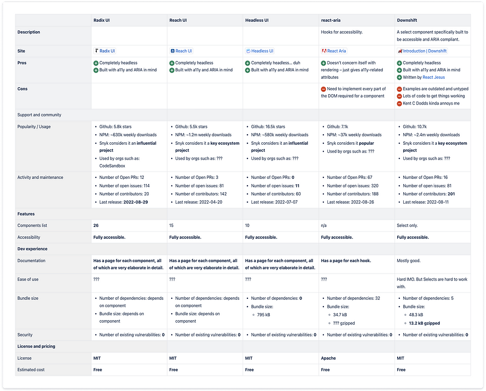
Before expanding Crystal 2.0, the team evaluated how the design system should work from both a design and engineering perspective.
A key decision was choosing a flexible foundation that gave designers enough control over visual styling while allowing engineers to build accessible, reusable components efficiently.
The team explored headless UI frameworks and selected Radix UI because of its accessibility support, flexible APIs, and compatibility with React. This gave the team a strong technical foundation without forcing the design system into a pre-styled visual language.
At the same time, we studied established design systems such as Material UI and Carbon to understand how mature systems handle component structure, usage guidance, states, accessibility, and documentation.
Aligning Design and API Structure
For Crystal to scale, the design and engineering models needed to speak the same language.
We worked toward a component structure where design properties in Figma could map clearly to implementation logic. For example, button and chip components needed predictable options such as size, intent, emphasis, state, and content.
This helped reduce ambiguity during handoff. Designers could make consistent decisions in Figma, and engineers could translate those decisions into reusable component APIs.

Planning the System
Once the technical and design direction was clearer, we mapped out the work needed to make Crystal more usable across teams.
The plan focused on:
-
Establishing foundational styles and themes.
-
Building reusable components in a structured hierarchy.
-
Creating clear usage documentation.
-
Improving Figma and Storybook alignment.
-
Supporting accessibility and responsive behavior.
-
Making the system easier for designers and engineers to adopt.
The goal was to avoid creating a static component library that only looked good in Figma. Crystal needed to function as a living system that could support real product workflows.

Design Principles
Before building components at scale, we defined principles that helped guide design decisions across the system.
Accessibility
Crystal needed to support inclusive product experiences. This meant considering color contrast, focus states, keyboard navigation, readable typography, and interaction states from the beginning rather than treating accessibility as a final check.
Scalability
The system had to support multiple teams, domains, and product surfaces. Components needed to be flexible enough for different use cases while still maintaining a consistent structure.
Clarity
Crystal needed to make design decisions easier. Clear naming, predictable variants, well-documented behavior, and consistent visual rules helped designers and engineers understand how to use the system confidently.
Component Architecture
We organized Crystal using an atomic design approach, breaking the system into smaller reusable pieces that could scale into more complex UI patterns.
This helped us create a shared mental model across the team: simple foundational elements could combine into more complex components and page-level experiences.
Atoms
Atoms included foundational elements such as buttons, text fields, checkboxes, avatars, and other small reusable UI elements. These formed the base layer of the system.

Molecules
Molecules combined multiple atoms into more functional UI groups, such as file upload areas, tab bars, notifications, and phone input fields.

Organisms
Organisms were larger interface structures such as tables, dialogs, and navigation components. These components shaped more complete workflows and helped teams build consistent product experiences faster.

Creating Flexible Figma Variants
A major part of the system work was turning individual UI elements into flexible, scalable Figma components.
For components such as buttons, we used variants and properties to define clear options for:
-
Intent
-
Emphasis
-
Size
-
State
-
Icon usage
-
Content structure
This made components easier to maintain and easier for designers to use correctly. Instead of detaching components or creating one-off variations, designers could select the right variant based on the use case.
For example, button intent helped communicate the purpose or priority of an action. Emphasis controlled how visually prominent the button should be. State defined how the component behaved during hover, focus, pressed, disabled, or loading interactions.
This improved consistency while still giving designers enough flexibility to work across different product contexts.

Foundations: Styles, Themes, and Tokens
Crystal also needed a strong foundation for visual consistency across product and web experiences.
We worked on styles and themes across:
-
Color
-
Typography
-
Layout
-
Spacing
-
Responsive behavior
-
Component states
The system had to adapt ApplyBoard’s brand guidelines for real product usage. Marketing guidelines helped define the brand foundation, but product interfaces needed additional rules for usability, accessibility, density, responsiveness, and repeated interaction patterns.
This foundation made it easier to build templates, components, and product screens without redesigning basic visual decisions every time.


Documentation and Usage Guidelines
A design system only works if people know how to use it.
To support adoption, we created clear documentation for designers covering component usage, variants, states, best practices, accessibility notes, and style guidance.
The goal was to reduce guesswork. Designers should be able to understand when to use a component, which variant to choose, what behavior to expect, and how to stay aligned with the broader system.
This documentation also helped onboard new designers faster and created a shared reference point during design reviews.


Patterns for Reusable Product Problems
Components are the building blocks of the interface, but patterns explain how those components work together to solve common user problems.
For example, a text field is a component. But form validation, including error messaging, helper text, required fields, and recovery behavior, is a pattern.
By documenting patterns, Crystal helped teams create more consistent experiences for repeated problems such as forms, validation, navigation, status feedback, and user actions.
This helped the design system move beyond visual consistency and into product experience consistency.


Governance and Cross-Team Collaboration
After the core system work, the focus shifted to keeping Crystal connected across teams.
Because ApplyBoard had multiple product domains, not every component needed to become part of the global system. Some components were specific to a domain, while others had value across multiple teams.
We supported an intake process where teams could request components to be added to Crystal. These requests were reviewed based on reusability, scalability, design quality, and whether the component solved a broader product need.
This helped Crystal stay flexible without becoming messy. Domain teams could still move quickly, while the global system remained consistent and maintainable.

Keeping Figma and Storybook Aligned
A key part of maintaining the design system was making sure Figma and Storybook stayed in sync.
We reviewed which components were missing, outdated, or inconsistent between design and development. Each component was assessed based on whether the Figma design matched the Storybook implementation, whether assets were properly exported, and whether documentation was complete.
This helped the team prioritize updates and reduce the gap between design intent and shipped UI.

Breaking Work Into Trackable Tasks
To make the system maintainable, we broke larger design system updates into smaller tasks and tracked them through Jira and Confluence.
Each task could move through review, approval, and implementation more clearly. This helped designers and engineers understand what was in progress, what needed review, and what had already been resolved.
This process made Crystal easier to maintain as a living system rather than a one-time design cleanup.

Impact
Crystal helped ApplyBoard create a more consistent and scalable product UI foundation.
The system improved:
-
UI consistency across product and web surfaces.
-
Reuse of components and patterns across teams.
-
Design–engineering alignment through shared documentation and Storybook collaboration.
-
Designer efficiency through reusable Figma components and variants.
-
Onboarding for new designers through clearer guidelines.
-
Accessibility and responsive consistency through shared standards.
-
Maintenance by reducing duplicated components and one-off design decisions.
While Crystal continued to evolve, it gave teams a stronger shared foundation for designing and building product experiences at scale
What I Learned
Working on Crystal taught me that a design system is not just a component library. It is a product that serves designers, engineers, and ultimately end users.
The most important lessons were:
-
Naming, structure, and documentation matter as much as visual design.
-
Design systems need governance, not just components.
-
Figma and Storybook alignment is critical for trust.
-
A good system balances consistency with flexibility.
-
Adoption depends on making the system easy to understand and easy to use.
Next Steps
If I were continuing to evolve Crystal, I would focus on:
-
Expanding complex product patterns.
-
Improving Storybook parity across more components.
-
Introducing usage analytics to understand adoption.
-
Strengthening accessibility documentation.
-
Creating clearer contribution guidelines for domain teams.
-
Building more examples that show components in real product workflows.
Crystal created the foundation. The next step would be making the system even more measurable, mature, and deeply embedded into everyday product design and engineering workflows.